First impressions – choosing the right front door colour
Choosing your front colour is important. After all, a new front door is an investment for the long term.
The choice of front door for your home has a huge impact on the aesthetic of your house. A front door that is smart, well-maintained and in keeping with the property can really lift the overall appearance of a home. The choice of door colour is a core part of the impact and impression that’s given.
Whether you’re choosing a front door colour for your forever home, or revamping with the intention of selling, we can help you make the perfect choice.

The meaning of colour
Certain colours have intrinsic meaning – both in the emotions they can evoke in us, but also in how they tend to be used in our everyday lives. When choosing a front door colour, it’s interesting to understand some of these associations.

Red
The colour of passion and energy, red draws attention. It is a bold and powerful colour. Brighter reds are synonymous with danger or warning.
Green
Green is the colour of nature and harmony, known for being calming and welcoming. It is often used to symbolise health, wellbeing and positivity.
Blue
Trust and loyalty are all associated with the colour blue. It is a colour that is thought to make us feel secure, calm and confident. It’s a reliable, trustworthy colour – that’s why so many businesses use it in their logos (including us!).
Black
The colour of power, sophistication and elegance, black is a strong and authoritative colour that can make us feel protected.
White
Purity and innocence are associated with white. It evokes simplicity, cleanliness and perfection. It is often used to signify openness and clarity.
Grey
The colour of compromise and control, grey is neutral and unemotional. The colour of rock, it is stable and reassuring and can invoke a feeling of calmness and reassurance.
Brown
Comforting and protecting, brown is the colour of stability. It can make us feel grounded and is often used to denote wisdom and reliability.
Purple
Spirituality and imagination are associated with purple. Royalty, luxury and mystery are all synonymous with this colour.
Yellow
The colour of sunshine, yellow is optimistic. Often used to bring fun and joy, it’s evocative of happiness.
Orange
Uplifting and energetic, like yellow, orange is a colour of joy and fun. It has an energy and warmth and is associated with creativity and youth.
Pink
Love and compassion are synonymous with the colour pink. It is friendly and playful and has connotations of warmth and romance.
Right house, right door, perfect colour
Understanding the psychology of colour is fascinating, but when choosing the right front door colour for your property, there are practical, aesthetic and location related aspects that are helpful to consider.
Here we explore the most popular door colours and the styles of property that they can be best suited to.
Into the blue
For properties situated in or near coastal towns, chalky blues are popular and evocative of seaside atmosphere.
Duck egg blue, or eau de nil are subtle, muted shades that are complementary to many styles of house and are currently popular in both interior and exterior décor for their calm tones.
Stronger blues such as teal and midnight blue can be very smart and elegant. They complement brick (being opposite on the colour wheel to brick orange) and work beautifully with white or stone surrounds.
Shades of grey
Grey is a very versatile colour.
Deeper, rich greys can work well for modern properties, giving a contemporary but timeless feel. Softer greys work well for period properties, complementing old brick and stone and giving subtle warmth.


Neutral statement
Neutral tones can give a calming, natural feel and can be used to give cohesion to other decorative aspects of the home, be it windows, paving, stone or paintwork.
There is no limit to the number of neutral shades available and they are very popular in interior decorating for the fact that they provide a subtle backdrop to splashes of colour with furnishing and décor.

A little green
Green can be a great choice for rural homes or to give a natural, welcoming feel. It complements stone beautifully. Soft sage greens are timeless and work very well against brick.
Deeper shades of green contrast strikingly with white painted houses.

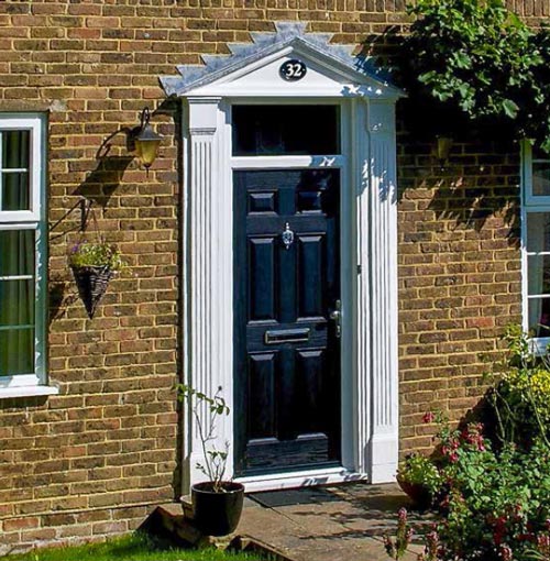
Back to black
Black is a classic choice that it’s difficult to go far wrong with – especially for traditional properties. It always looks smart, it contrasts well with silver and gold toned door furniture and works well with brick, stone and painted houses.
It’s no wonder that it was deemed most suitable for a famous address beginning No.10.

Red-letter day
Red doors can really make a statement if you want your front door to stand out. It complements brick well and creates strong contrast with painted or stone houses.
Rich, deep reds have a feel of sophistication.

Bright and bold
For some houses, it’s great to stand out from the crowd and be playful with door colour.
Pinks, oranges and yellows are bright, warm, welcoming and fun. With terraced houses, or on roads where the properties are all similar in style, it’s a great way to differentiate your home and inject some personality.

Our door is open
When it comes to door colour, with the Duo range of composite doors, the sky is the limit. RAL colour matching means that your Duo entrance door can come in any one of 15,000 shades!
Visit our welcoming showroom, where you’ll see examples of our extensive selection of entrance doors using our configurator as well as examples in the showroom – and start thinking about your favourite colour…